Design2 min read
Motion that delights without making anyone dizzy
Reduced motion isn’t an afterthought. The patterns we use to keep animation inclusive – and still lovely.
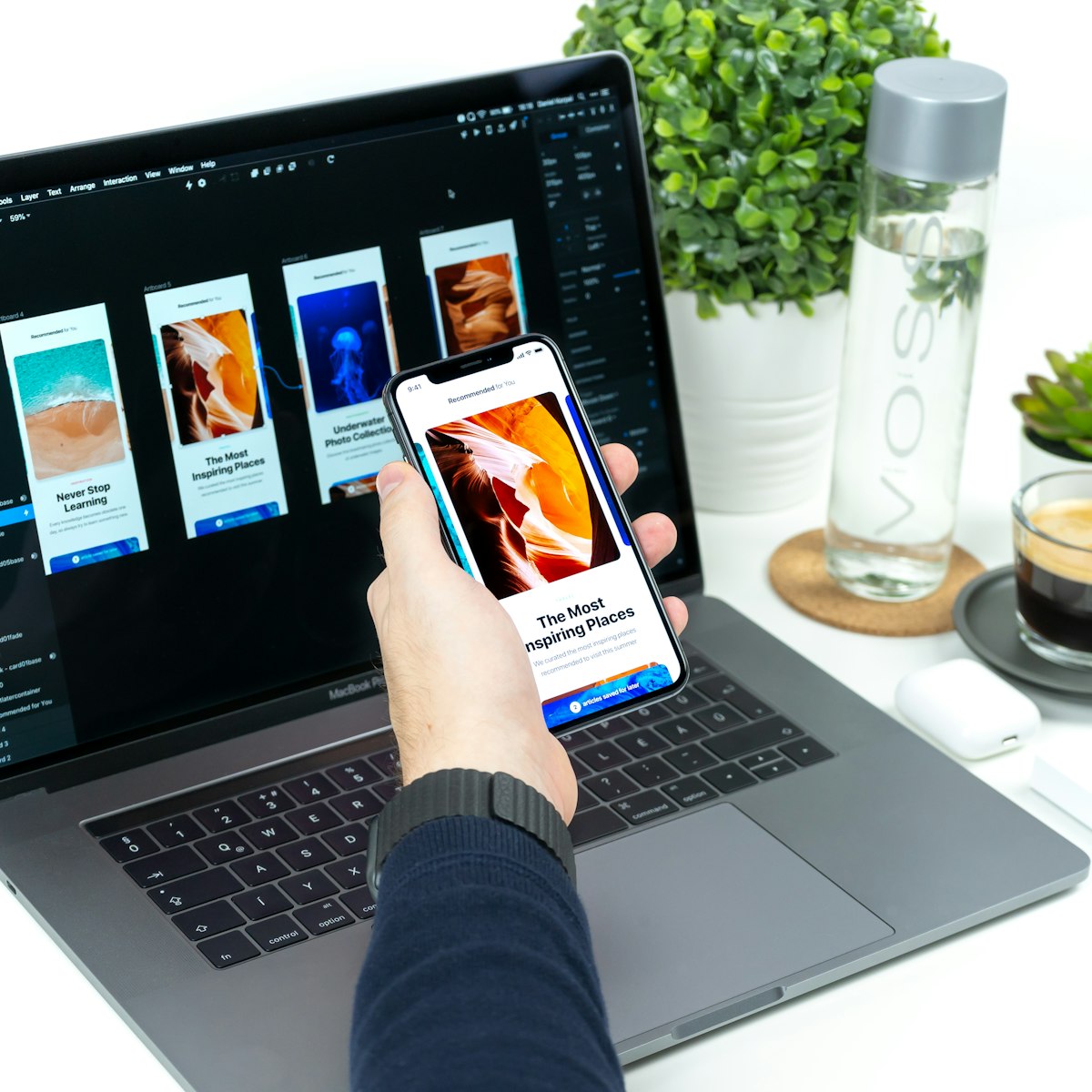
Good animation makes an interface feel alive. It shows where things come from, confirms that a tap worked and gives a brand some personality. Bad animation, for some people, is physically unpleasant.
For people with vestibular disorders, large or fast movement on a screen can cause dizziness, nausea and headaches that last for hours. Others find constant motion distracting, which makes it hard to read or concentrate. Designing motion responsibly isn’t about removing it – it’s about making it optional where it needs to be.
Respect the setting people already chose
Every major operating system has a “reduce motion” setting, and browsers expose it to websites through the prefers-reduced-motion media query. When someone turns it on, they’re telling every site and app what they need. We treat it as a requirement, not a nice-to-have.
Reduced doesn’t have to mean none. In most cases, we replace big movements with gentle fades, which keep the sense of change without the movement that causes trouble.
Reduced motion means less movement, not less design.
Patterns we use
- Keep transitions short. Most interface animation should finish in 150 to 300 milliseconds.
- Prefer fades and small movements over large slides, zooms and spins.
- Avoid parallax and scroll-jacking for anything important. If you use them, switch them off when reduced motion is on.
- Never auto-play long animations or videos without a visible way to pause them.
- Never flash. Content that flashes more than three times a second can trigger seizures.
- Animate meaning, not decoration. If you can’t say what the motion tells the user, it’s probably noise.
What the guidelines say
The Web Content Accessibility Guidelines (WCAG) cover motion in a few places. Moving or auto-updating content that lasts more than five seconds needs a way to pause, stop or hide it. Content must not flash more than three times in any one second. And at the highest level of the guidelines, animation triggered by interaction should be possible to switch off.
Meeting these isn’t only about compliance. It’s the baseline for a site that everyone can use comfortably.
Test it yourself
The easiest step is also the most revealing: turn on reduced motion on your own phone and laptop for a day, then use your website. You’ll quickly see which animations still play, which pages feel broken without them and which ones you don’t miss at all.
That last group is worth noticing. More often than not, the animations nobody misses can simply go – and the site feels faster for everyone.
Keep reading
All articles- Design
2 min read
What a design system really costs – and when it pays you back
Year one always costs more than the spreadsheet says. Year three is where it earns its keep. Here’s how we budget design systems honestly.
- Development
2 min read
Core Web Vitals in 2026: what still moves the needle
INP has replaced FID and the bar keeps rising. A practical checklist from the launches we’ve shipped this year.
- Branding
2 min read
Five signs it’s time for a brand refresh
Not every dip in sales needs a new logo. These are the signs that your brand really is holding you back.

Like how we think?
From the journal to your brief.
Everything we write about, we also do for clients. Send us a challenge – the person who wrote the article may well be the one who answers.
Or write to us