Case study · Northwind
One page of checkout, twice the sales
Northwind’s five-step checkout was losing two carts in three. We rebuilt it as a single fast page, and sales more than doubled.
- Client
- Northwind
- Year
- 2026
- Category
- E-commerce
- Industry
- Retail
01 The results
- Conversion rate
- +118%
- Abandoned carts
- −52%
- Load time on mobile
- 1.2s
02 The story
Northwind had outgrown a checkout built eight years earlier: five steps, two separate prompts to create an account and a payment page that took four seconds to load on a phone. Almost two in three shoppers who started it never finished.
We began by watching real sessions instead of reading reports. The pattern was hard to miss. People weren’t leaving because of the price; they were leaving because the form kept asking for things it already knew.
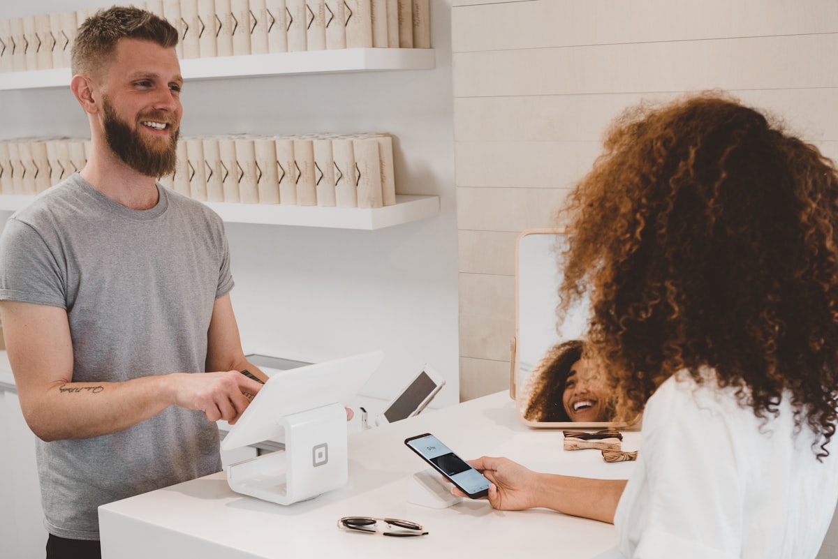
The new checkout fits on one page. An address lookup fills the form with a single tap, guest checkout is the default, and Apple Pay and Google Pay sit above the card form rather than hidden behind it. Every field we could fill in automatically, we did.
We launched it as a split test against the old flow. A week in, the gap was so wide that Northwind asked us to switch the old checkout off early.
What we did
Planning something like this?